Data Statistics
Data Statistics
After collecting questionnaire data, users often have the need for simple analysis of the data. The data analysis function is used to statistically analyze the questionnaire data, quickly generating statistical charts for each question without the need for professional tools. The data analysis function is a core component of online survey questionnaire system software, mainly used for organizing, classifying, and summarizing the collected questionnaire data. It provides insights through data analysis, supports users in making data-driven decisions, automatically generates data reports, displays key indicators and analysis results, and helps users understand respondents' behaviors and preferences. The data analysis function provides real-time data analysis, enabling users to quickly respond to data changes, improves the accuracy of data analysis using algorithms and statistical methods, and automates data analysis to reduce the time and errors of manual data processing. At the same time, it presents data in intuitive charts and graphs, making complex data understandable even for non-professional users.
Analysis Variables
Data analysis is based on analysis variables. Both metadata and survey questions are converted into analysis variables. These variables are divided into the following types:
- Metadata Variables
- Question Variables
Metadata Variables
Metadata is automatically added marking information during the survey collection process, such as channel, collector, time taken, and submission time.
Question Variables
Questions or options within the survey are converted into corresponding question variable types, including: Checkboxes (for Multi-Choice), Category, Numbers, Matrix Category, and Matrix Numbers.
Different question types correspond to different question variables. The rules are as follows:
- Choice Questions, Drop DownMenu Questions, Icon Selection Questions, Image Selection Questions, Hotspot Questions
-
For Single-Choice Options: The question can correspond to Category and Numbers variables for quantitative or numerical analysis. During numerical analysis, the corresponding option number is used as the specific value for statistical purposes.

-
For Multi-Choice Options: The question corresponds to a Multi-Choice type variable for quantitative analysis. The options correspond to Category variables, and quantitative analysis is conducted based on whether each individual option is selected.
- Rating Scale Questions, Point Allocation Questions, Continuous Scale Questions
- The options can correspond to Category and Numbers variables for quantitative or numerical analysis. Quantitative analysis is based on the possible scores appearing in the results, such as how many people have assigned a certain score.

- Ranking Questions
- The question corresponds to Matrix Category and Matrix Numbers variables, allowing for quantitative or numerical analysis of all options. The options correspond to Category and Numbers variables based on the question variable type, with the analysis type being the same as that for rating questions.
- Matrix Questions
- The options correspond to Category variables, and quantitative analysis can be conducted based on whether they are selected.
- Cascading Dropdown Questions
- Since cascading questions are constructed using menu questions, the first-level menu question, serving as the primary menu for the cascading question, does not have a corresponding variable. The second-level menu question, used as the secondary menu, is equivalent to a multiple-choice question. The question corresponds to a Checkboxes type variable for quantitative analysis. The options correspond to Category variables, with quantitative analysis being conducted based on whether each individual option is selected.
The question corresponds to the Multi-Choice type variable for quantitative analysis. The options correspond to Category, and quantitative analysis is conducted based on whether each individual option is selected.
Types of Data Analysis
Data analysis is conducted based on variables, allowing for descriptive or correlational analysis of data.
- Describe: Statistical analysis of a single variable.
- Relate: Cross-analysis of two variables.
Data analysis can be primarily divided into two categories:
- Quantitative Analysis: Focuses on category-based analysis derived from sample size, yielding information such as category-based counts and percentages. Most analyses are based on this type.
- Numerical Analysis: Analysis centered around numerical values, yielding results such as average, median, variance, maximum, minimum, percentage, and bar charts showing numerical distribution.
Describe
- Meta-Information Variables
- Channel: Counts the number of responses from different channels, presented in a progress bar.
- Collector: Counts the number of responses from different collectors, presented in a progress bar.
- Time Consuming: Counts the number of responses within different time intervals, presented in bar chart form.
- Submission Time: Counts the number of responses within different response time intervals, presented in bar chart form.
- Question Variables
- Multiple-choice: Provides the count, percentage, and bar chart of responses for each option.
- Category: Provides the count, percentage, and cumulative percentage of responses for each category, presented in a progress bar.
- Numbers: Provides the total sample size, average, median, minimum, maximum, variance, and conventional percentage values, with a bar chart showing the score distribution.
- Matrix Category: Calculates the response count for each sub-variable category.
- Matrix Numbers: Calculates the response count, average, median for each sub-variable, with a bar chart showing the score distribution for each sub-variable.
Relate
Relate (Association analysis) provides the capability to jointly analyze two variables. Matrix Category (Matrix Cat) and Matrix Numbers (Matrix Num) do not directly participate in the association analysis process; instead, their respective Category (Cat) and Numbers (Num) variables derived from their options are used for the association analysis.
- Association analysis between Meta-information and Question Variables
- When the question variable is of the Multi-Choice type: The cross-counts and percentages of meta-information with each option (distinguishing between selected and unselected options) are obtained.
- When the question variable is of the Category type: The cross-counts and percentages of meta-information with each category are derived.
- When the question variable is of the Numbers type: The score distribution (bar chart), average, median, and sample count information after crossing meta-information with numerical values are obtained.
- Association analysis between Question Variables within the Same Question
-
Association analysis between Category (Cat) and Numbers (Num): The cross-distribution results of various Category (Cat) and Numbers (Num) variables are calculated, yielding score distribution (bar chart), average, median, and sample count information.

-
Association analysis between Multi-Choice and Numbers (Num): The cross-distribution results are calculated based on each option (distinguishing between selected and unselected) and the Numbers (Num) variable.

-
Association analysis between Numbers (Num) and Numbers (Num): A numerical statistics table and score distribution bar chart for each Numbers (Num) value are provided.

-
Association analysis between Category (Cat) and Category (Cat): The cross-distribution among various Category (Cat) variables is calculated, including sample counts and percentages.

-
Association analysis between Category (Cat) and Multi-Choice: Cross-calculations are performed based on each option (distinguishing between selected and unselected) and the Category (Cat), yielding quantity and percentage distribution results.

-
Association analysis between Multi-Choice and Multi-Choice: Cross-calculations are performed based on each option (distinguishing between selected and unselected), yielding quantity and percentage distribution results.

When performing association analysis on two questions, not all scenarios will yield cross-results. For example, cross-results cannot be obtained between fill-in-the-blank and multiple-choice questions. The system automatically determines the type of cross-analysis results that can be obtained for the selected questions. When results cannot be obtained, the corresponding button will be deactivated, indicating that the currently selected questions cannot be analyzed using cross-analysis.
Basic Operations for Data Analysis
Above the data analysis page, there is a toolbar for basic operations in data analysis. The settings in this toolbar will affect all data.

The main functions include:
Workspace
The workspace is used to categorize data analysis charts. For example, survey data on restaurant satisfaction can be divided into workspaces for service satisfaction, environment satisfaction, and food satisfaction. Each workspace contains only the data analysis charts corresponding to its respective questions, facilitating quick access to the required data charts.
- Create Workspace: Create a new workspace and save the current data analysis card within it.
- Switch Workspace: Switch workspaces by selecting a name from the workspace dropdown menu.
- Share Workspace: Generate a web link for the workspace and set a web access password.
- Manage Workspace: Edit or delete a specified workspace.
Filter
The filter in a data analysis card is only effective for the data in that card, while the filter in the data analysis toolbar affects all data, serving as a global data filter with higher priority than the card-specific filter. The functions of the global data filter are identical to those of the data table filter.
Export
Export Statistics
The export function in a data analysis card only exports the data from that card, while the export function in the toolbar exports all data analysis cards in the current workspace. The exported file is in Excel format, with each card's data represented as a separate sheet in the Excel file. The charts exported to the Excel file use native Excel components, allowing for secondary editing and adjustment within Excel software.
Manage Exported Statistics
Exported data is generated as files in the cloud. By clicking "Manage Exported Data," a dialog box appears displaying all exported files. Select a file and click "Download" to retrieve the data file from the cloud. Alternatively, click "Delete" to remove the file from the cloud.
Settings
Analysis Setting
- Confidence Level: Set the confidence level parameter for Pearson analysis.
- Decimal Places: Control the number of decimal places.
- Weight: Select a data weighting scheme, and the system will automatically adjust the statistical base for the data charts.
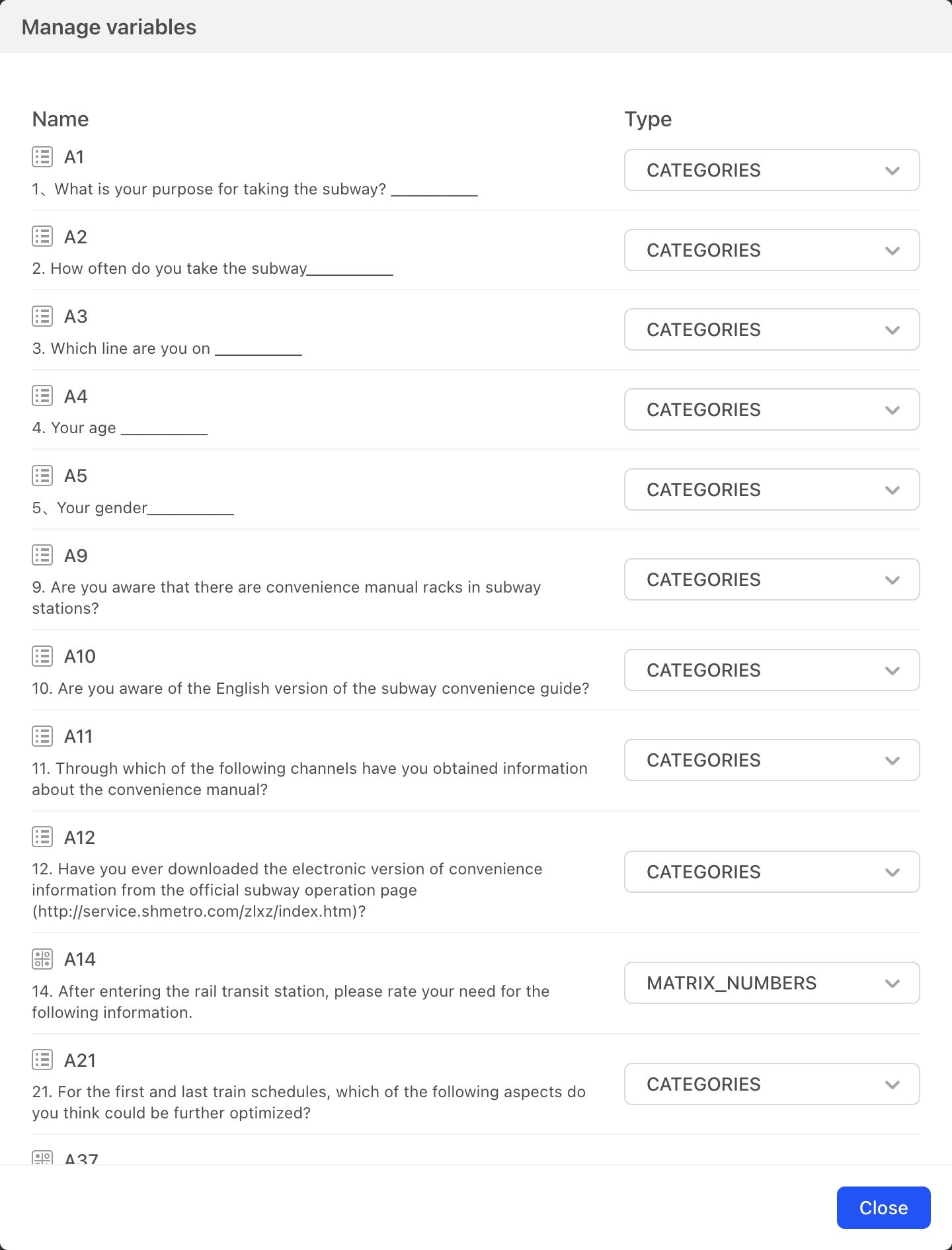
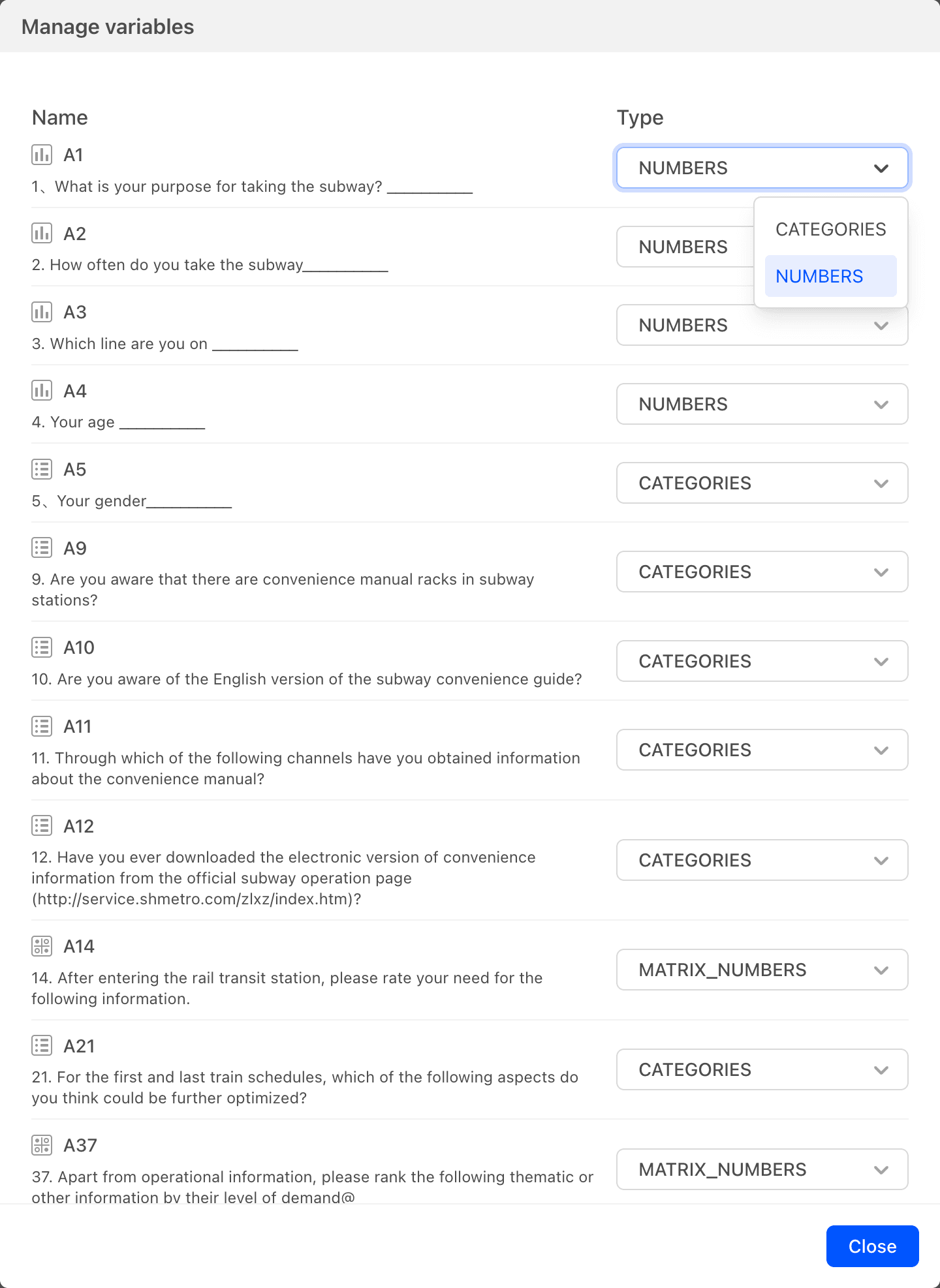
Variable Setting
Set the analysis type for the data, with options for type or numerical value. Most question types include options that have both text and a number, corresponding respectively to Category and Numbers in variable types used for data analysis. Different variable types will yield different statistical analysis results. When necessary, you can change the variable type used in the analysis.
Click Variable Settings to open a dialog box listing all survey questions and the current variable types being used for data analysis and statistics. Click the Type dropdown menu to switch the variable type.
 As shown in the image, for Question A1 you can choose between Category and Numbers. Category is used by default; once Numbers is selected, statistical analysis of Question A1 will be based on numeric values.
Card Sorting
Open the card sorting dialog box and click the up or down arrows on the right side of the data table question list to change the order of the cards.
Update Data Analysis Cards
After the chart is generated, as questionnaire data is collected, it is necessary to import the data to update the chart with the latest data results.
Import Data with Valid Answers
During importation, for numerical values such as scoring questions, ranking questions, demonstration evaluation questions, and fill-in-the-blank questions (with numeric input restrictions), the system automatically skips data results that have not been answered. For example, if a scoring question is set with a range of 1-10 points, and actual answers only include 8, 9, and 10 points, if unanswered items are filtered out, the data results will only include statistics for 8, 9, and 10 points; if all items are imported, statistics will be generated for 1, 2, 3, 4, 5, 6, 7, 8, 9, and 10 points.
Import Data with All Answers
Import all data results, including all numerical values.
Generate Data Analysis Charts
Rich Text
Cards that allow input of rich text information can be used for purposes such as data card descriptions.
Describe
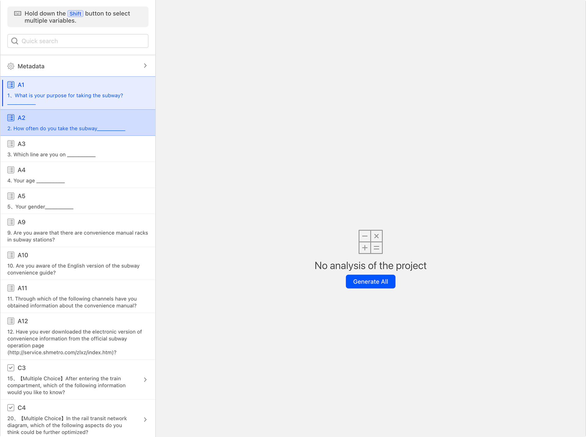
The data analysis page is mainly divided into two areas: left and right. By default, when entering the page, there are no analysis charts, as shown in the figure below:
The left side displays the current questionnaire question list. By entering content in the search box above the questionnaire question list, you can quickly search for matching questionnaire questions. Select one questionnaire question from the list, and the "Describe" button on the top right will be activated, indicating that a data analysis card can now be generated.
Click the "Describe" button to generate a data analysis card as shown below.
After selecting one questionnaire question from the list, the number "1" will appear in the "Describe" button, indicating that one data analysis card can be generated. When pressing the Shift key and selecting multiple questionnaire questions, the number will change accordingly, representing that multiple data analysis cards can be generated at once.
Relate
A correlation data chart requires two different data sources. Select two questionnaire questions while holding down the Shift key to activate the correlation button. If two questions are selected but the correlation button is not activated, it means that cross-data cannot be generated for these two questions.
Association Analysis Between Single-Choice and Single-Choice
 As shown in the figure below, after selecting A1 and A2, click the correlation button to generate the following cross-data analysis chart.
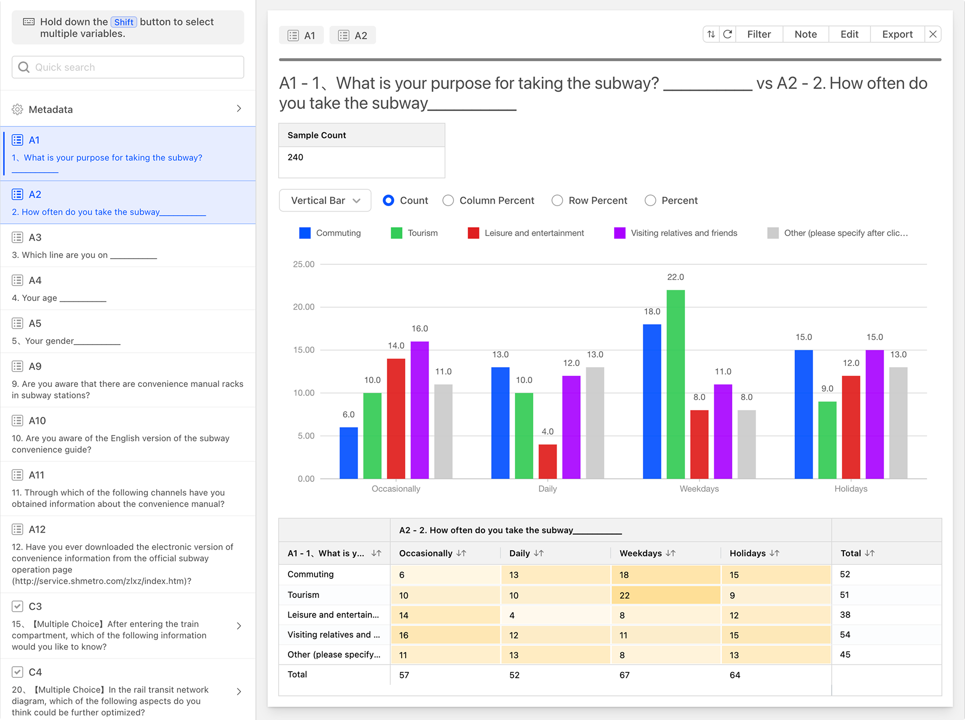 In the cross-data analysis chart, the rows and columns represent the options of A1 and A2, respectively. The numerical value at the intersection of a row and a column represents the number of respondents who selected both options.
For easier data interpretation, cells with larger values are displayed in darker shades, while those with smaller values are displayed in lighter shades.
Switching Statistical Methods for Correlation Data Analysis Charts
Cross-data analysis charts support multiple data statistical methods**:
-
Count: Calculates the number, which is the default statistical method.
-
Percent: Calculates the percentage of the total.

-
Row Percent: Calculates the percentage by row.

-
Column Percent: Calculates the percentage by column. The column percentage option is displayed only when both selected questions are single-choice.

Association Analysis Between Single-Choice and Multiple-Choice Data
Select one single-choice question and one multiple-choice question from the question list to generate the following correlation analysis chart.
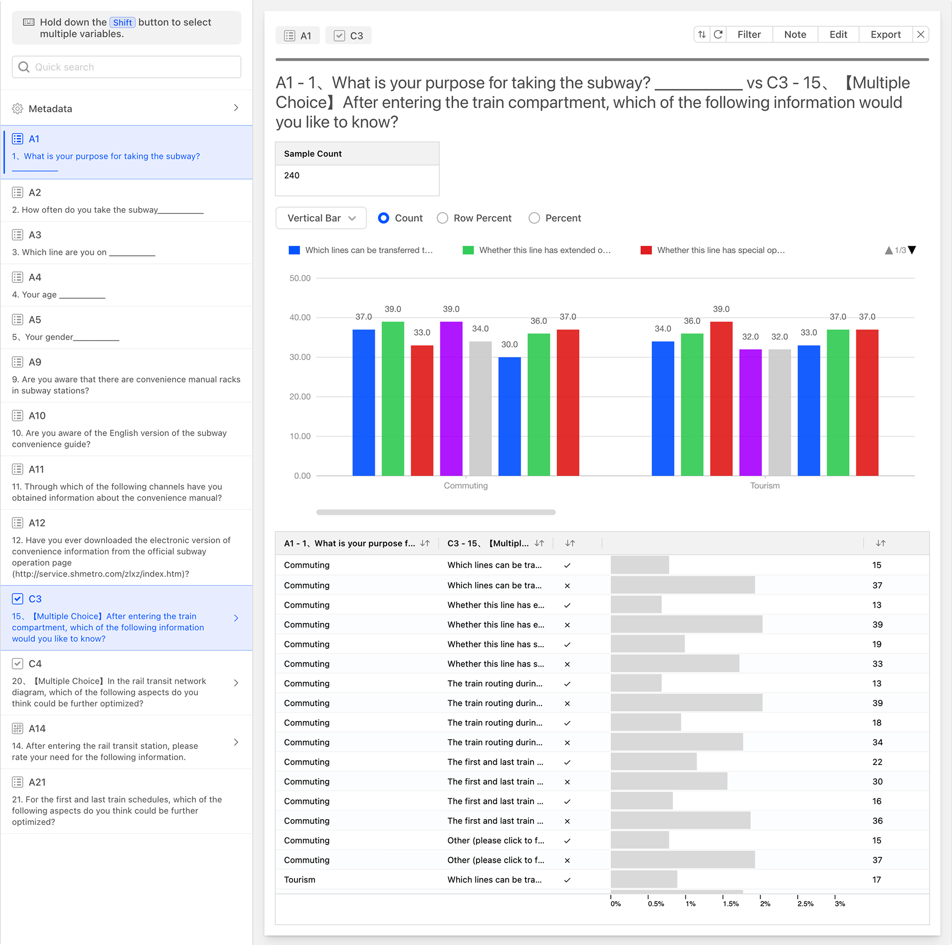
The correlation between single-choice and multiple-choice involves matching all options of the two questions in pairs and collecting statistics. In the table above, the two leftmost columns represent all options of the single-choice and multiple-choice questions, matched in pairs, with each matching rule occupying a row. The remaining data columns, from left to right, are:
- Selected: Indicates whether the current cross-rule is selected or not.
- Count: The number of instances for the current cross-rule.
- Percent of Data: The percentage displayed in a progress bar format.
Association Analysis Between Multiple-Choice and Multiple-Choice
Select two multiple-choice questions from the question list to generate the following correlation analysis chart.
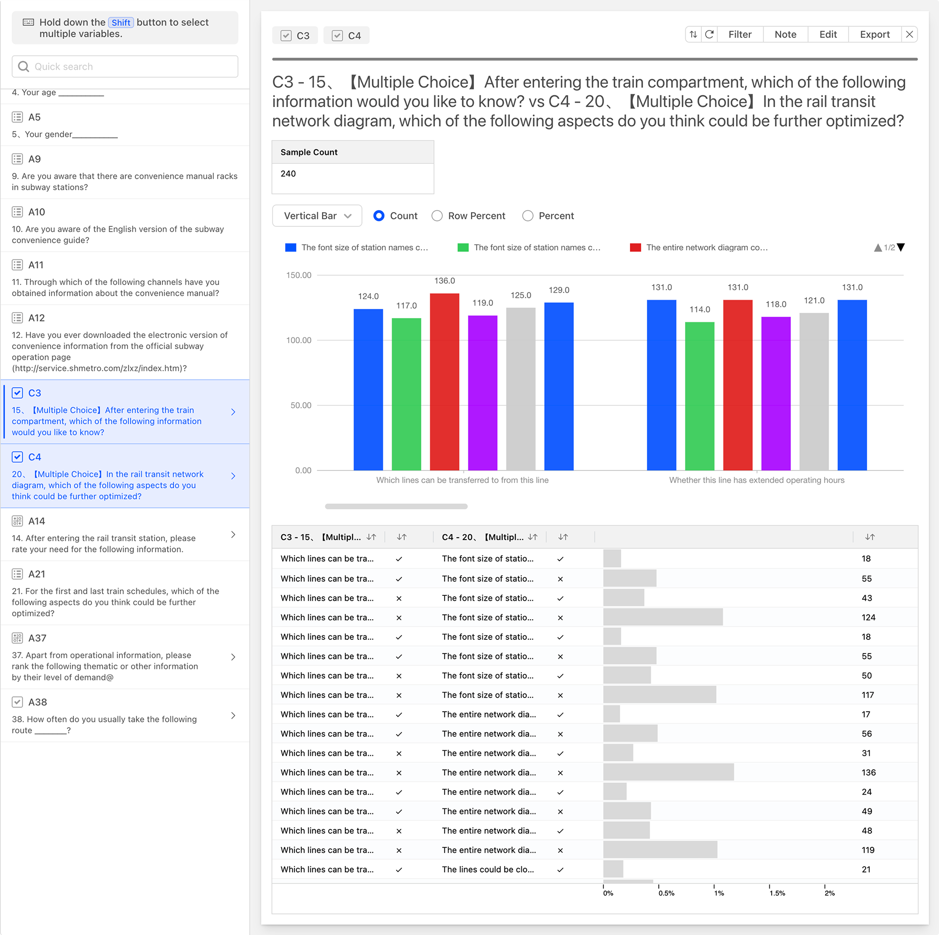
Similar to the data correlation between single-choice and multiple-choice, the data correlation between multiple-choice and multiple-choice also involves matching all options of the two questions in pairs and collecting statistics. In the table above, the four leftmost columns represent all options of the two multiple-choice questions, matched in pairs based on whether the options are selected. Each matching rule occupies a row. The remaining data columns, from left to right, are:
- Count: The number of instances for the current correlation rule.
- Data Percentage: The percentage displayed in a progress bar format.
Advanced
Pivot
Pivot table is a powerful data analysis tool primarily used to summarize, analyze, and present information from a data source. It allows users to quickly extract valuable insights from vast amounts of data in an interactive manner. With simple layout changes, a Pivot Table can comprehensively, multi-dimensionally, and dynamically perform statistical analysis on data, helping users discover the inherent relationships and patterns within the data.
A Pivot Card consists of the following components:
- Rows: For placing row labels, used to categorize data based on a certain dimension.
- Columns: For placing column labels, used to categorize data based on another dimension.
- Values: For placing data columns that need to be summarized and calculated, displaying the aggregated results.
After selecting row and column data, the system will automatically generate a data calculation report. By clicking to add values, more numerical calculation methods can be incorporated. The numerical aggregation methods provided by the system include: Count, Percentage, Row Percentage, and Column Percentage.
A Pivot Table is an extremely powerful data analysis tool that can help users quickly extract valuable information from large datasets and discover the inherent relationships and patterns within the data. Through reasonable Pivot Table layout and analysis, users can better understand and utilize data to support decision-making.
Notes
The Pivot Card provides limited pivot functionality. The Crosstab feature of the system provides more comprehensive and enriched functionality for data cross-tabulation.
Price Sensitivity Meter (PSM)
Price Sensitivity Meter (PSM) is an effective pricing strategy tool that helps companies better understand consumers' acceptance of prices and purchasing intentions, thereby formulating more reasonable pricing strategies. The PSM model measures target customers' satisfaction and acceptance of different prices to understand their perceived appropriate product prices, thus obtaining an acceptable price range for the product. It seeks to find the optimal balance between a reasonable price and overall attractiveness to potential customers, and is commonly used to help businesses identify and optimize pricing strategies for products or services.
During the PSM testing process, participants are typically presented with a price test scale covering all possible price points and are asked to make choices or evaluations regarding different price points. Specifically, the testing method may include a price gradient table encompassing the possible price range of the product, with participants invited to make four choices on this table: a price that is slightly high but acceptable, a price that is slightly low but acceptable, a price that is too high to accept, and a price that is too low to accept.
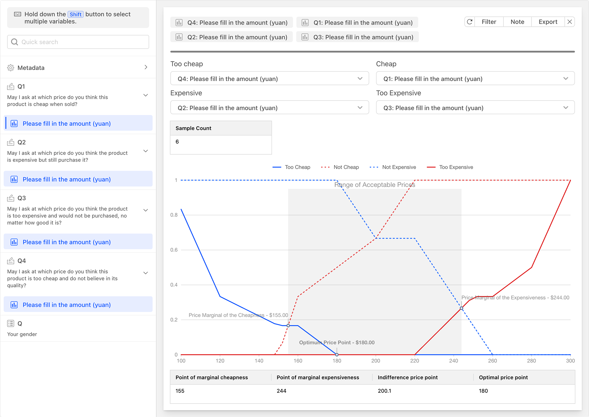
By analyzing the collected data, the PSM model can help companies understand the following key points:
- Price Elasticity: The degree to which changes in price affect consumers' purchasing intentions. By calculating changes in purchasing intentions at different price points, the price elasticity of the product can be assessed.
- Optimal Price Range: The price range that maximizes profits. Within this range, consumers will not refuse to purchase due to high prices, nor will the company lose too much profit due to low prices.
- Pricing Strategy Recommendations: Based on consumer feedback and data analysis, the PSM model can also provide specific pricing strategy recommendations, such as whether to conduct price promotions or introduce products at different price levels.
The PSM model is primarily applicable to new product testing, especially for new pharmaceutical products, new high-tech products, and other products without competing products. Its advantage lies in its simplicity and clarity, as all price points are based on participants' own comparisons and are continuous. Additionally, the PSM model provides an important reference for pricing tests before new product launches, helping companies formulate reasonable pricing strategies.
Notes
- Purchasing Power Consideration: Although the PSM model considers consumers' acceptance levels, it may overlook their purchasing power. Therefore, when formulating pricing strategies, it is also necessary to comprehensively consider the purchasing power of the target consumer group.
- Sample Size Selection: To avoid the influence of random errors, the sample size should be sufficiently large and representative. At the same time, attention should be paid to the rationality of the questionnaire or interview design and the accuracy of data collection.
- Lack of Competitor Information: A limitation of the PSM model is that it does not consider competitor information. In some cases, competitors' prices and positioning may have an important impact on consumers' purchasing decisions. Therefore, when formulating pricing strategies, it is also necessary to analyze and judge based on the market environment and competitor conditions.
Kano Model
The Kano Model, proposed by Noriaki Kano, a professor at Tokyo Polytechnic University, in the 1980s, is a product development and customer satisfaction theory. It is primarily used for classifying and prioritizing customer needs, demonstrating the relationship between products or services and customer satisfaction, and providing effective methods for designing customer-satisfying products and services. The Kano Model has been widely applied in product management, project management, marketing, product requirement user research, product operations, event planning, and other fields. It helps companies better understand user needs, thereby formulating product strategies that better meet market demands. By identifying the impact of different functions on user satisfaction, companies can optimize resource allocation and invest limited resources in functions that can bring the greatest benefits.
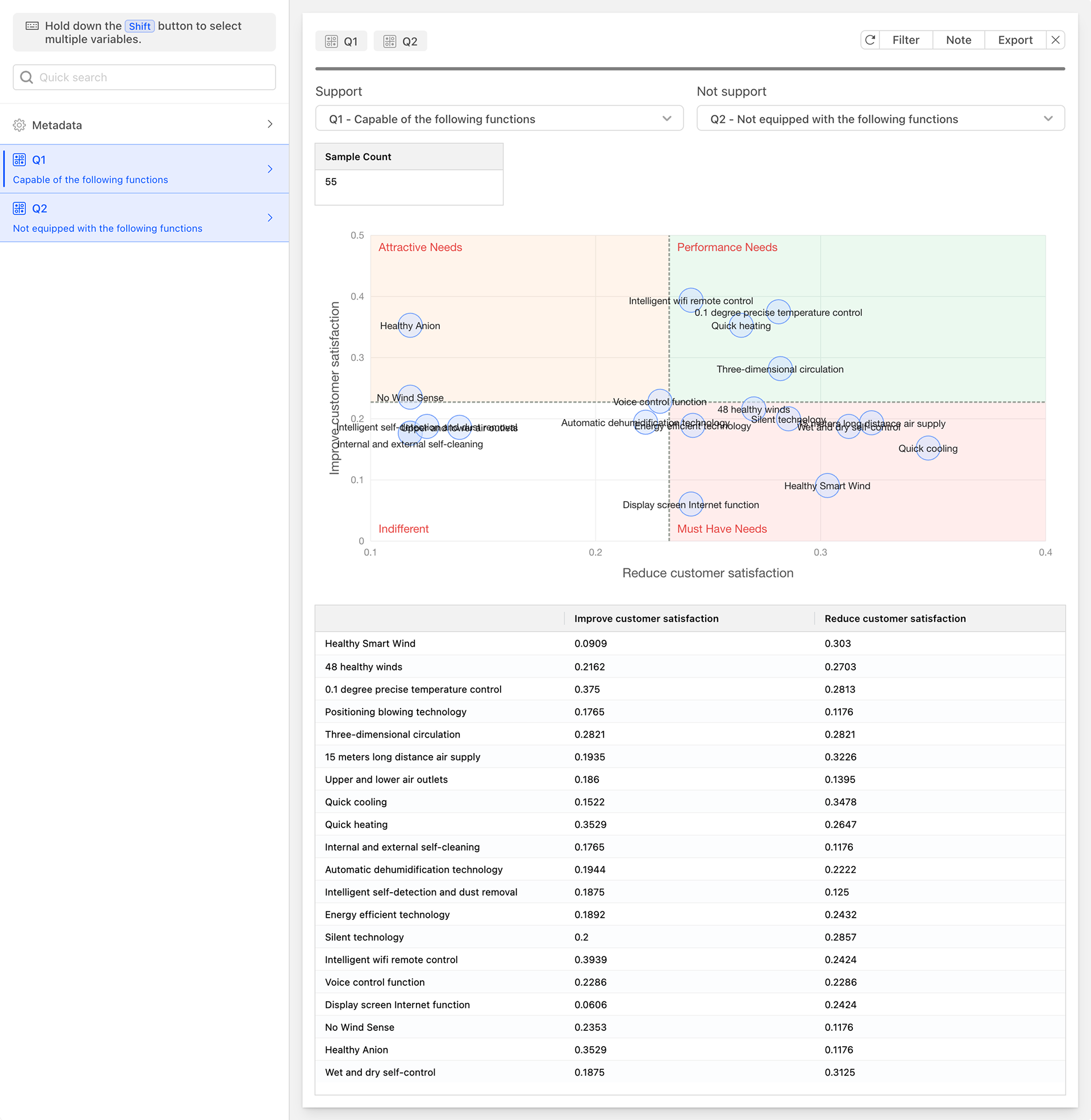
The Kano Model reflects the nonlinear relationship between product performance and user satisfaction. Based on the relationship between different types of quality characteristics and customer satisfaction, it divides the quality characteristics of products/services into five categories:
-
Must-be Quality (M):
- Also known as basic quality or threshold attributes. These are functions or services that a product must provide; if not, users will be very dissatisfied. They are the threshold for a product to enter the market and are considered essential by consumers.
- Examples: Calling function and safety performance of mobile phones; guest rooms and catering services provided by high-star hotels.
-
One-dimensional Quality (O):
- Also known as unary quality or performance attributes. When a product provides such functions or services, user satisfaction will increase; conversely, if not provided, user satisfaction will decrease.
- Examples: Users will be very satisfied if a mobile phone has a long standby time and strong signals; guests will be satisfied if a hotel provides standard services expected by customers.
-
Attractive Quality (A):
- Also known as exciting quality or motivators. Even if such functions or services are not provided, user satisfaction will not decrease; however, when provided, user satisfaction will greatly increase, sometimes even guaranteeing the competitiveness of the product or service.
- Examples: A mobile phone with additional smart sharing features will outperform traditional mobile phones.
-
Indifferent Quality (I):
- Whether such functions or services are provided or not, there will be no significant change in user satisfaction. In cases of limited resources, such functions or services can be prioritized lower.
- Examples: Gifts provided by airlines or hotels that have no practical value to customers.
-
Reverse Quality (R):
- Users do not have such needs, and providing them will lead to decreased satisfaction.
- Examples: Over-servicing can cause反感 among many customers.
When applying the Kano Model, questionnaire questions should be designed with both positive and negative dimensions, as well as five levels of "like very much," "as it should be," "indifferent," "can accept," and "dislike very much" for problem design. After collecting data, it should be organized and analyzed to understand the satisfaction corresponding to each quality type. Coefficient analysis is used to identify the demand attributes of the function (e.g., must-be, one-dimensional, attractive, indifferent). Based on the coefficients, the various functions of the product need to be marked on the same four-quadrant diagram, with high absolute coefficient values being prioritized and corresponding implementation plans formulated.
Notes
- Needs vary from person to person, so it is important to meet the needs of the majority within the target customer group.
- Needs may differ due to cultural differences, so the impact of cultural differences on product needs should be considered.
- Needs change over time, and what was once a one-dimensional or attractive need may today have become a must-be need. Therefore, companies need to continuously investigate needs and iterate their products.
Pearson Correlation Analysis
Pearson Correlation Analysis is a widely used method to measure the strength and direction of a linear relationship between two continuous variables.
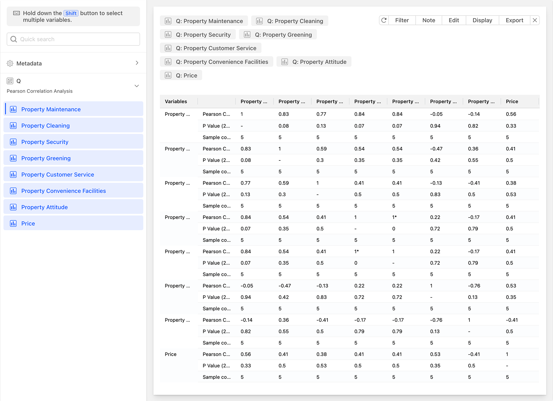
The Pearson correlation coefficient, usually denoted as r, is calculated based on the covariance between the variables and standardized to eliminate the influence of dimensionality. It is a value between -1 and 1. It measures the degree of linear correlation between two variables, where:
- r=1 indicates a perfect positive correlation, meaning an increase in one variable is accompanied by an equivalent increase in the other.
- r=-1 indicates a perfect negative correlation, meaning an increase in one variable is accompanied by an equivalent decrease in the other.
- r=0 indicates no linear relationship between the two variables.
Pearson Correlation Analysis is applicable in the following situations:
- Continuous Variables: Both variables should be continuous, meaning they can take any real numerical value.
- Linear Relationship: The relationship between the two variables should be linear, meaning changes in one variable can be approximately described by a linear function of the other.
- Normal Distribution: The data should come from a normally distributed or nearly normally distributed population. If the data does not conform to a normal distribution, the calculation of the correlation coefficient may be biased or inaccurate.
Pearson Correlation Analysis can help us identify and understand the linear relationship between two continuous variables, but it is important to note its applicable conditions and assumptions, and to interpret and apply it reasonably based on actual situations. In practical applications, the larger the absolute value of the Pearson correlation coefficient, the stronger the linear relationship between the two variables. It is commonly used for:
- Exploratory Data Analysis: In the initial stage of data analysis, the Pearson correlation coefficient can help identify which variables may have a linear relationship, providing clues for subsequent analysis.
- Hypothesis Testing: In statistics, by constructing statistical quantities and consulting tables to obtain critical values, one can determine whether the Pearson correlation coefficient is significantly different from zero, thereby indicating whether there is a linear relationship between the two variables.
- Prediction and Modeling: In statistical modeling such as regression analysis, the Pearson correlation coefficient can be used as one of the bases for selecting independent and dependent variables, as well as an indicator for assessing the predictive ability of the model.
Notes
- Nonlinear Relationships: The Pearson correlation coefficient can only measure linear relationships and cannot accurately reflect nonlinear relationships (such as curved relationships, exponential relationships, etc.).
- Outliers: Outliers (such as extreme values or isolated points) may have a significant impact on the calculation of the Pearson correlation coefficient. Therefore, attention should be paid to data cleaning and preprocessing when conducting correlation analysis.
- Causality: The Pearson correlation coefficient can only indicate the existence of a linear relationship between two variables but cannot explain the causality between them. Therefore, caution is needed when interpreting correlation results.
Importance-Performance Analysis (IPA)
Importance-Performance Analysis (IPA) is an effective evaluation tool whose fundamental idea stems from customers' satisfaction with products or services. This satisfaction arises from customers' level of importance they attach to various attributes of a product or service and their evaluation of the performance of these attributes.
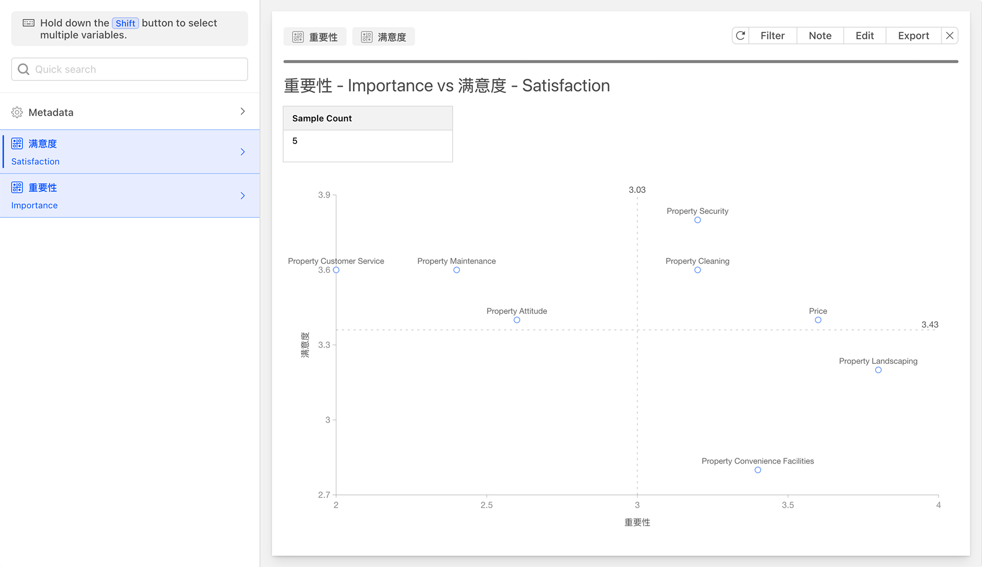
The IPA method constructs a two-dimensional quadrant graph to position each attribute of a product or service based on its importance and performance, thereby helping businesses identify areas that require priority improvement. In the IPA model, the horizontal axis represents importance, and the vertical axis represents performance (i.e., satisfaction). The overall average values of customers' evaluations of the importance and performance of product or service attributes serve as the dividing points for the X-Y axes, dividing the space into four quadrants, defined as follows:
- Quadrant A (Maintain and Enhance Area): The attributes located in this quadrant are highly valued by customers and are performed satisfactorily by the business. These attributes are the strengths of the enterprise and should be maintained and further enhanced to consolidate market position.
- Quadrant B (Over-Supplied Area): The attributes in this quadrant are not highly valued by customers but are performed satisfactorily by the business. These attributes may consume excessive resources of the enterprise without bringing corresponding improvements in customer satisfaction. Therefore, the enterprise may consider appropriately reducing or optimizing these attributes to allocate resources to areas that require more improvement.
- Quadrant C (Low Priority Area): The attributes in this quadrant are neither highly valued by customers nor performed satisfactorily by the business. Although these attributes have a certain impact on customer satisfaction, they are not critical factors. Therefore, in cases of limited resources, enterprises can prioritize the improvement of these attributes lower.
- Quadrant D (Focus on Improvement Area): The attributes in this quadrant are highly valued by customers but are not performed satisfactorily by the business. These attributes are key areas that require urgent improvement by the enterprise. By enhancing the performance of these attributes, enterprises can significantly improve customer satisfaction and loyalty.
The IPA method is commonly used in service industries, particularly in tourism, hospitality, and catering. The application steps typically include:
- Determine Evaluation Factors: Based on customer needs and service characteristics, determine the various factors for evaluating the service.
- Design Questionnaires: Develop questionnaires for customers to rate the importance and satisfaction of each service factor. The Likert scale is often used for rating.
- Collect Data: Collect customers' evaluation data through questionnaires.
- Analyze Data: Plot the data on the IPA matrix to form four quadrants. This step usually requires the use of statistical software (such as SPSS) for data visualization and analysis.
- Formulate Strategies: Based on the analysis results of the IPA matrix, formulate improvement strategies to optimize services. Focus on improving attributes in Quadrant D, while maintaining the strengths of attributes in Quadrant A, and considering optimizing or reducing attributes in Quadrants B and C.
Notes
The IPA method is an effective evaluation tool that can help enterprises accurately grasp customer needs, optimize service experiences, and enhance satisfaction. Its advantages lie in its simplicity and practicality, as well as the intuitive clarity of its analysis results. Through IPA analysis, enterprises can clearly identify which attributes are crucial to customer satisfaction and need improvement, and which attributes can be maintained or reduced. However, the IPA method also has certain limitations. It primarily focuses on the two dimensions of importance and satisfaction, which, while intuitively reflecting customers' preferences and expectations, may be somewhat insufficient in terms of the comprehensive development of products or services. Therefore, when applying the IPA method, enterprises should flexibly use and continuously optimize the analysis methods and steps based on actual situations.
Word Segmentation
A Word Segmentation, also known as a text cloud or tag cloud, is a graphical representation method used for visualizing text data.
A Word Segmentation displays the frequency of words in text through different sizes, colors, and fonts. In a Word Segmentation, the higher the frequency of a word, the larger its size displayed in the cloud, thereby intuitively highlighting key words or important concepts in the text. Essentially, a Word Segmentation is a type of dot plot, where text with specific styles is drawn at corresponding coordinate points.

The Word Segmentation is a powerful tool for visualizing text data. By intuitively showing the importance and frequency distribution of words, it helps users quickly grasp the main content and key information of the text.
Data Analysis Chart Card Settings and Operations
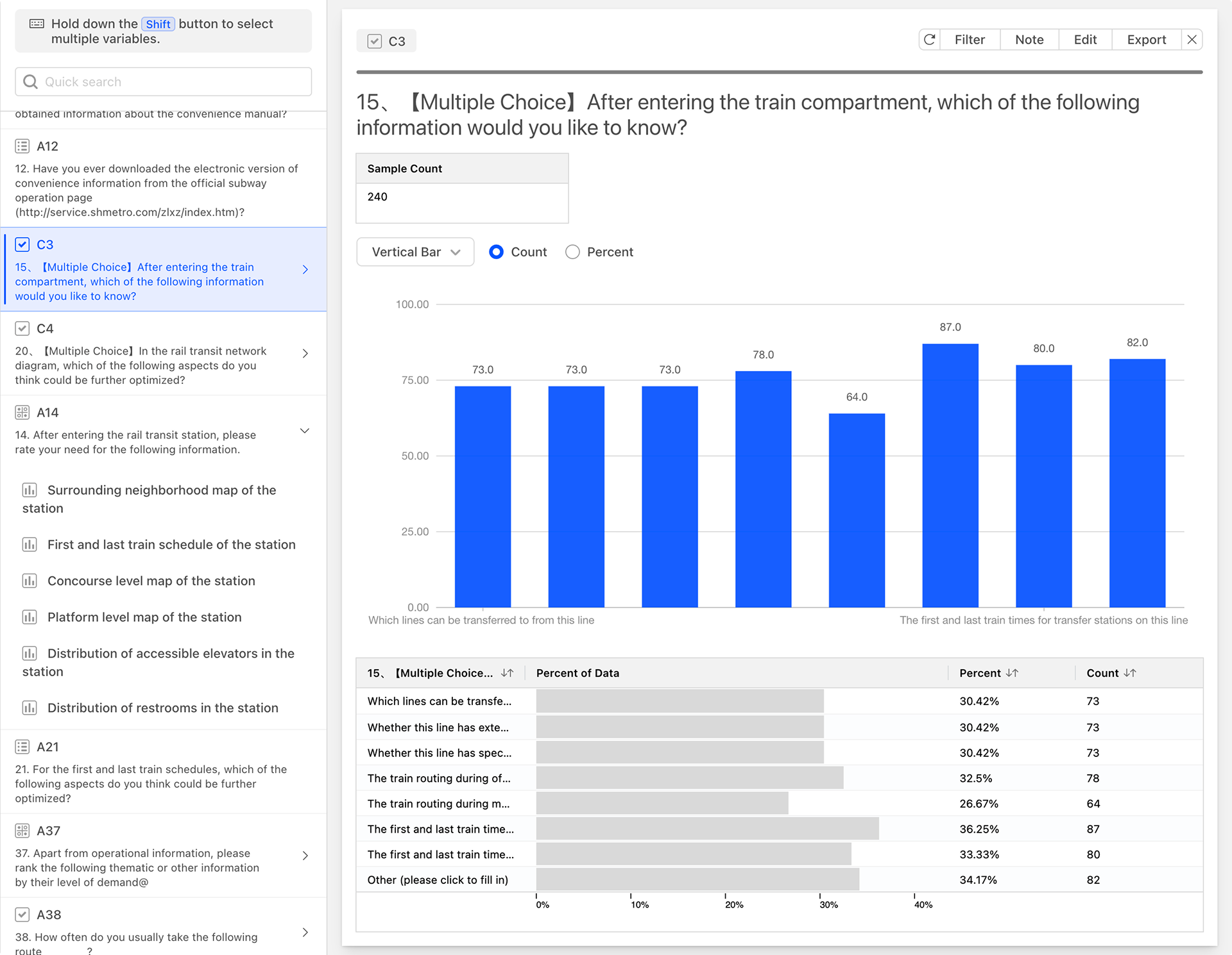
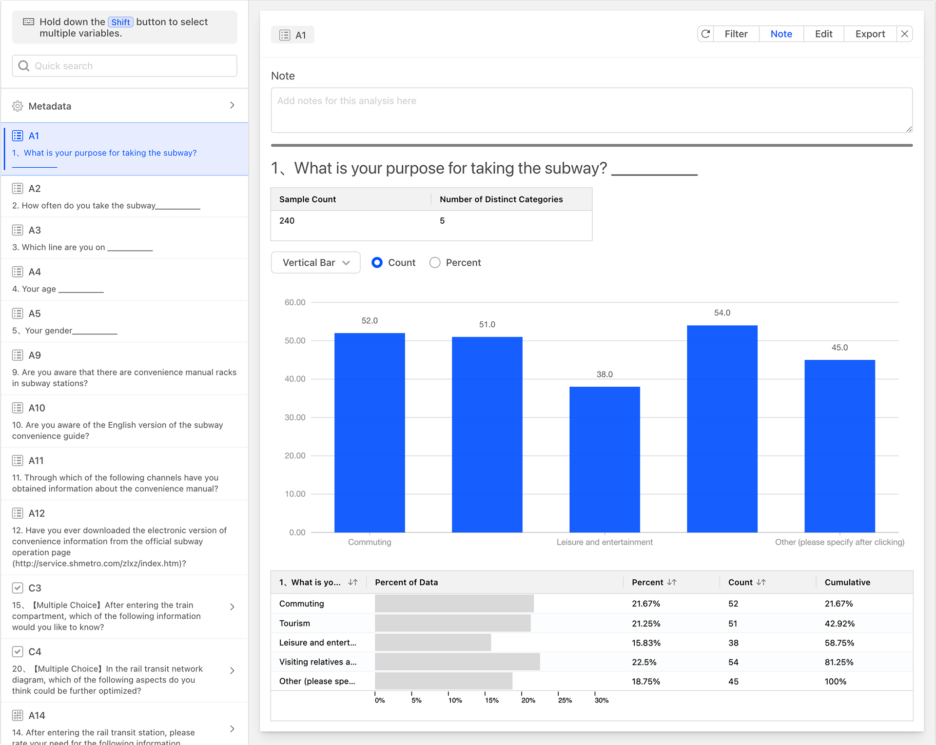
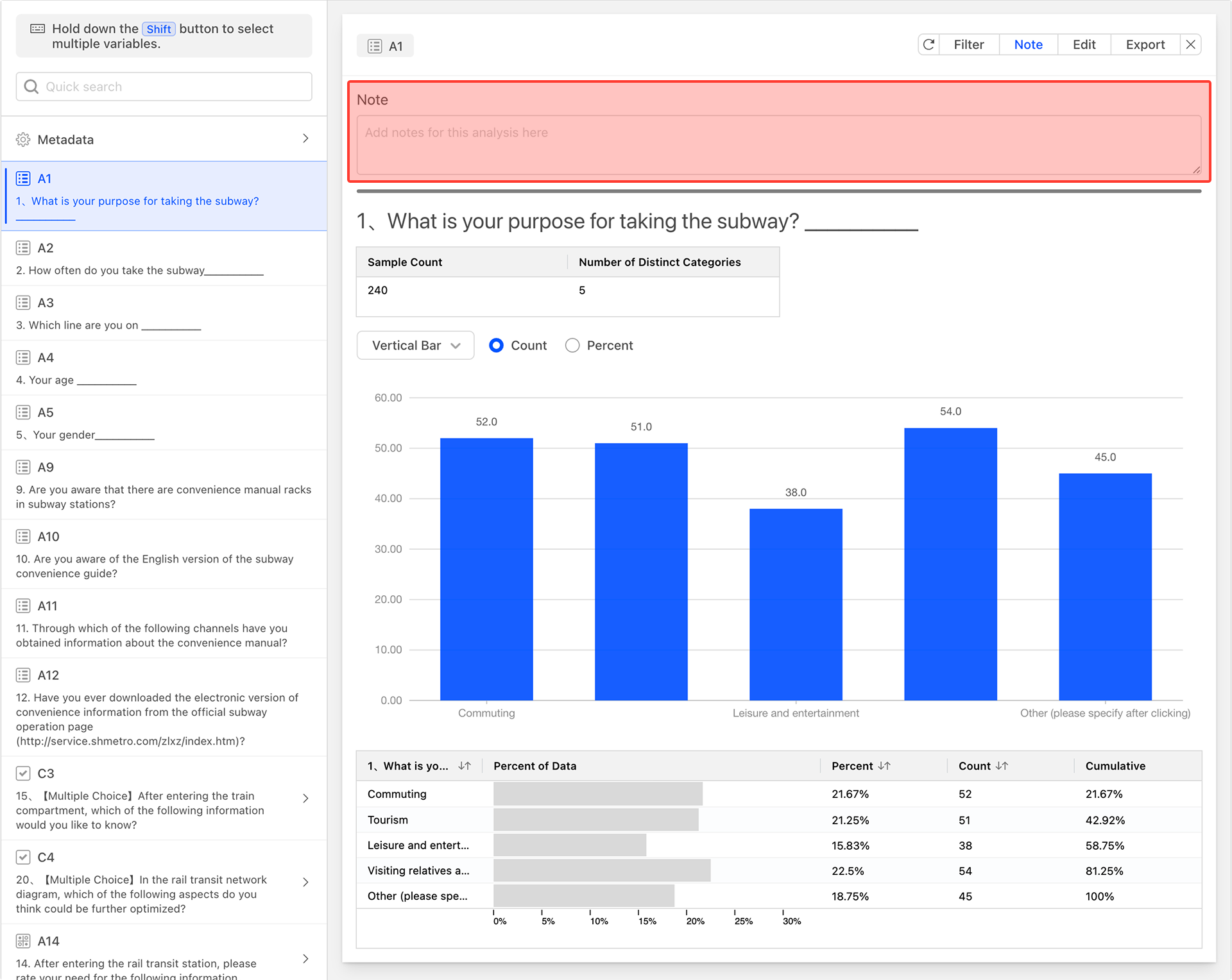
After generating the data analysis chart, the system will create a data analysis card for the selected questions.
Data Analysis Table
The data analysis card includes a data analysis table, with columns from left to right as follows:
- Question Options: Each row of the table represents the statistical analysis data for each option of the question.
- Percent of Data (Confidence Interval): The percentage of respondents who selected the option, displayed in a progress bar format. The denominator for calculating the percentage is the total number of respondents who reached this question during the survey response process, excluding those who did not reach it due to skip logic.
- Percent: Proportion statistics, the same as the confidence interval (data percentage).
- Count: Quantity statistics.
- Cumulative: The cumulative percentage value from top to bottom.
Sample Statistics Table
The small table located above the data table serves as the sample statistics table, providing an overview of the current question. The columns of the table, from left to right, are as follows:
- Sample Count: The total number of respondents who have reached this question during the questionnaire response process.
- Number of Distinct Categories: The total number of different option categories selected by the respondents who have reached this question.
Sorting the Data Analysis Table
Clicking on the column headers of the data table allows you to set the sorting rules for the data table. The image below shows the effect of sorting the data analysis table in descending order by the count column after clicking on it.
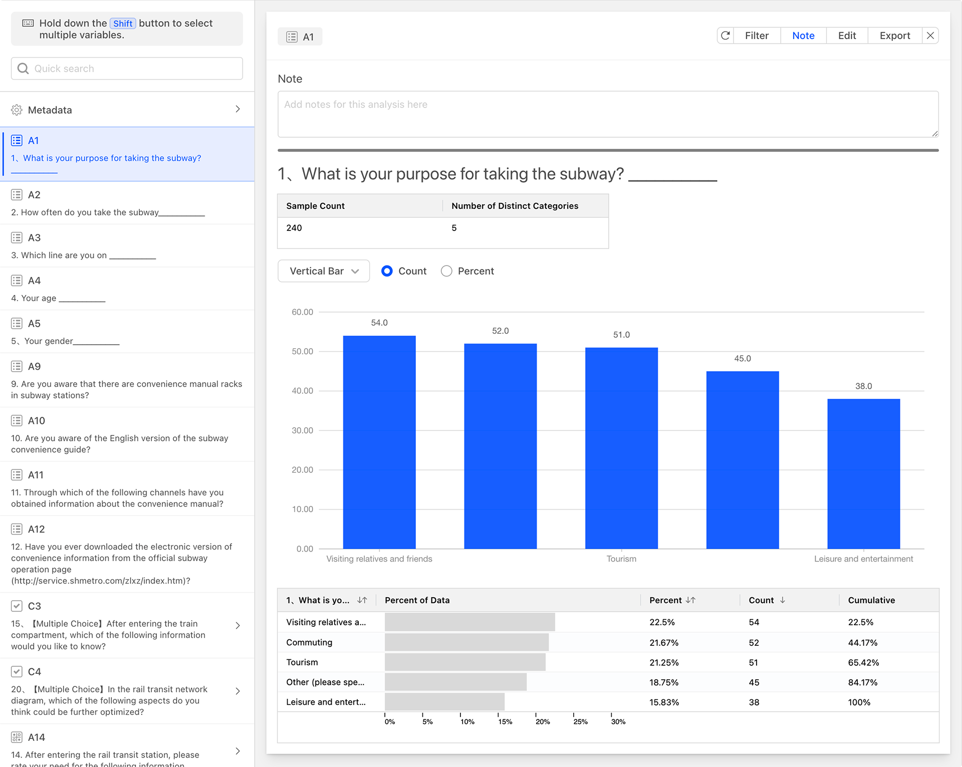
Filtering Card Data
You can filter the data generated on the card to generate new statistical analyses. Click the Filter button in the top right corner of the data analysis chart card, set the required conditions in the filter, and the current data analysis card will be automatically refreshed and the new data will be applied after saving. The filter on the data card has a lower level than the global filter, and can be regarded as a secondary data filter based on the data set of the global filter.
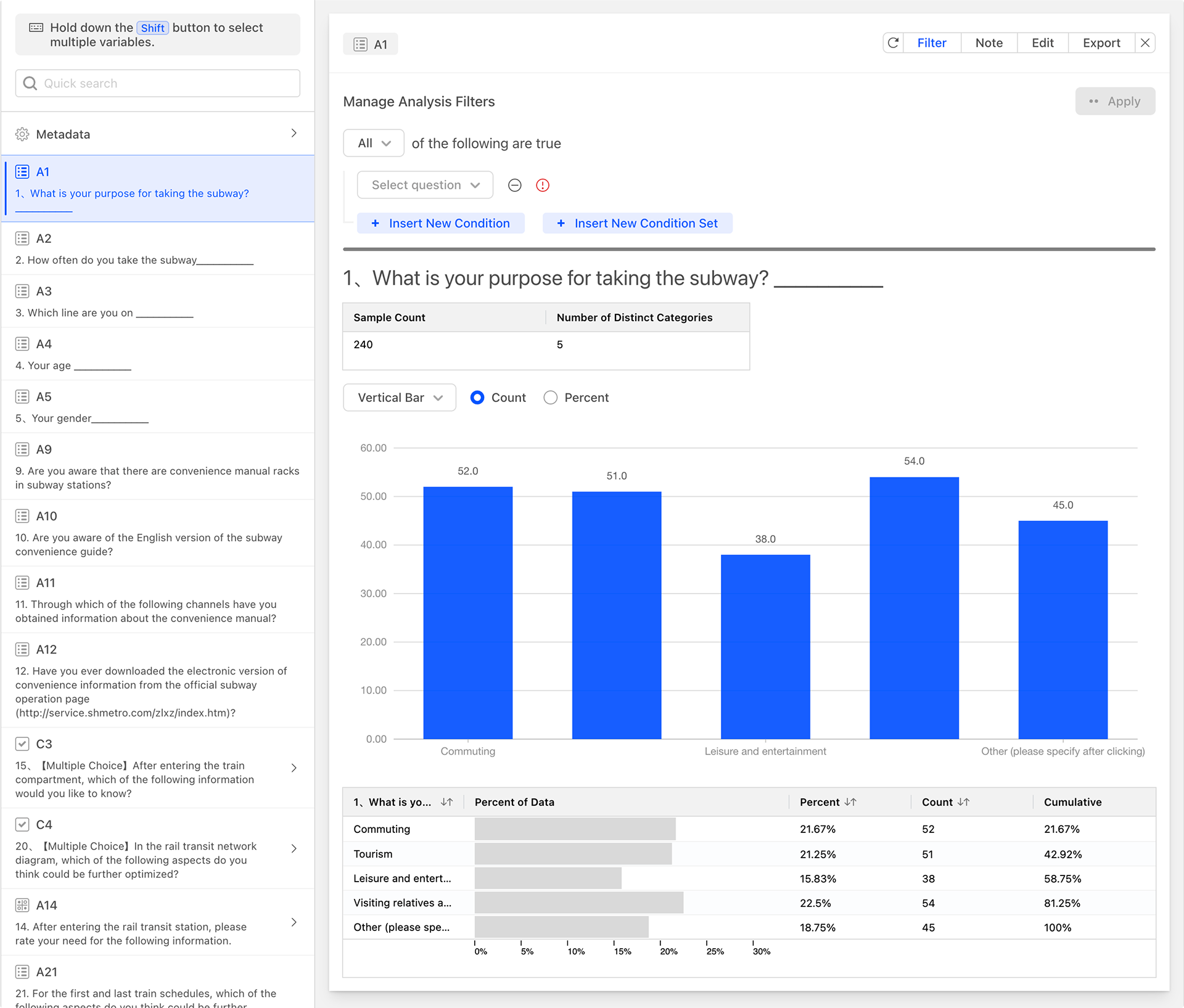
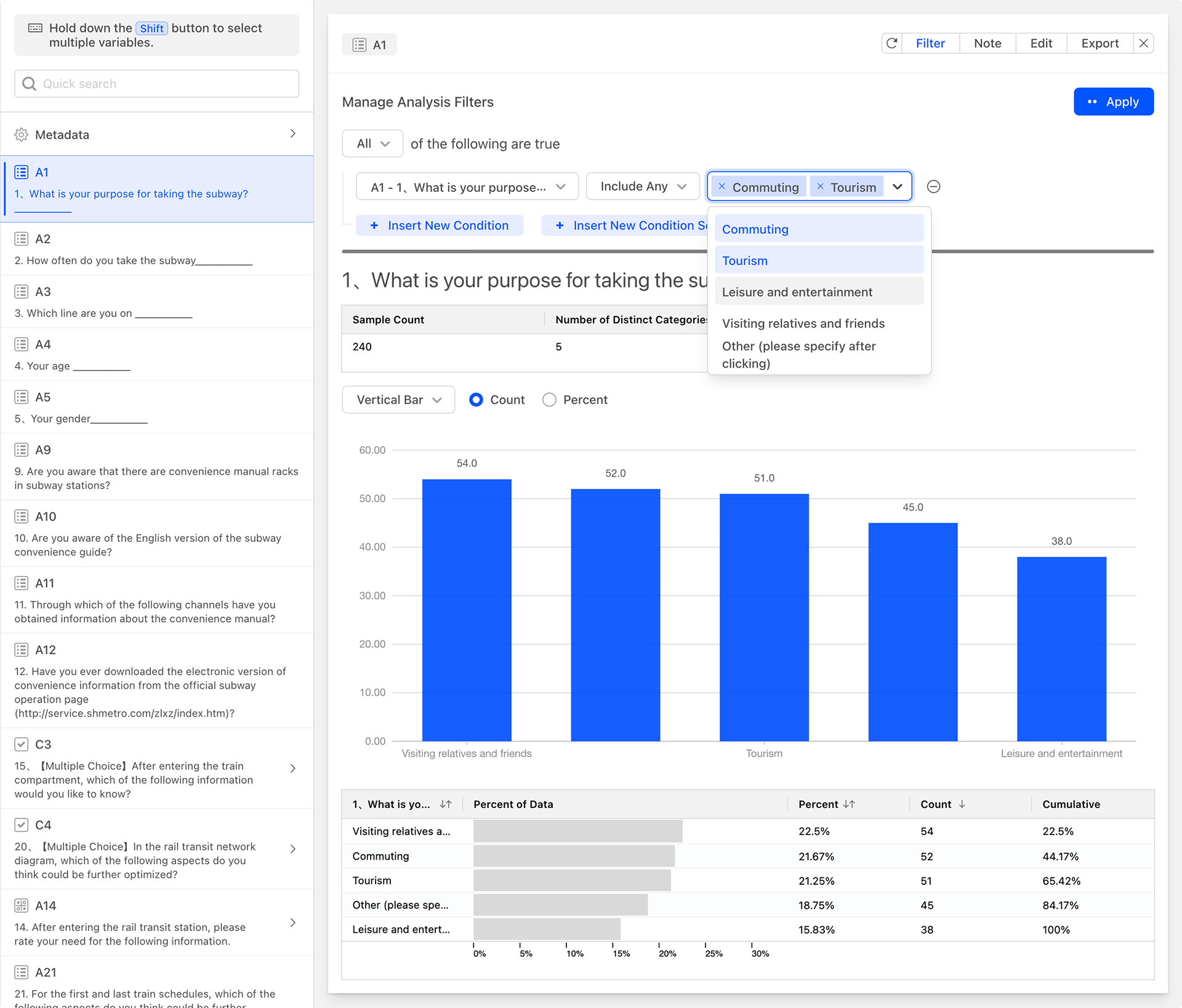
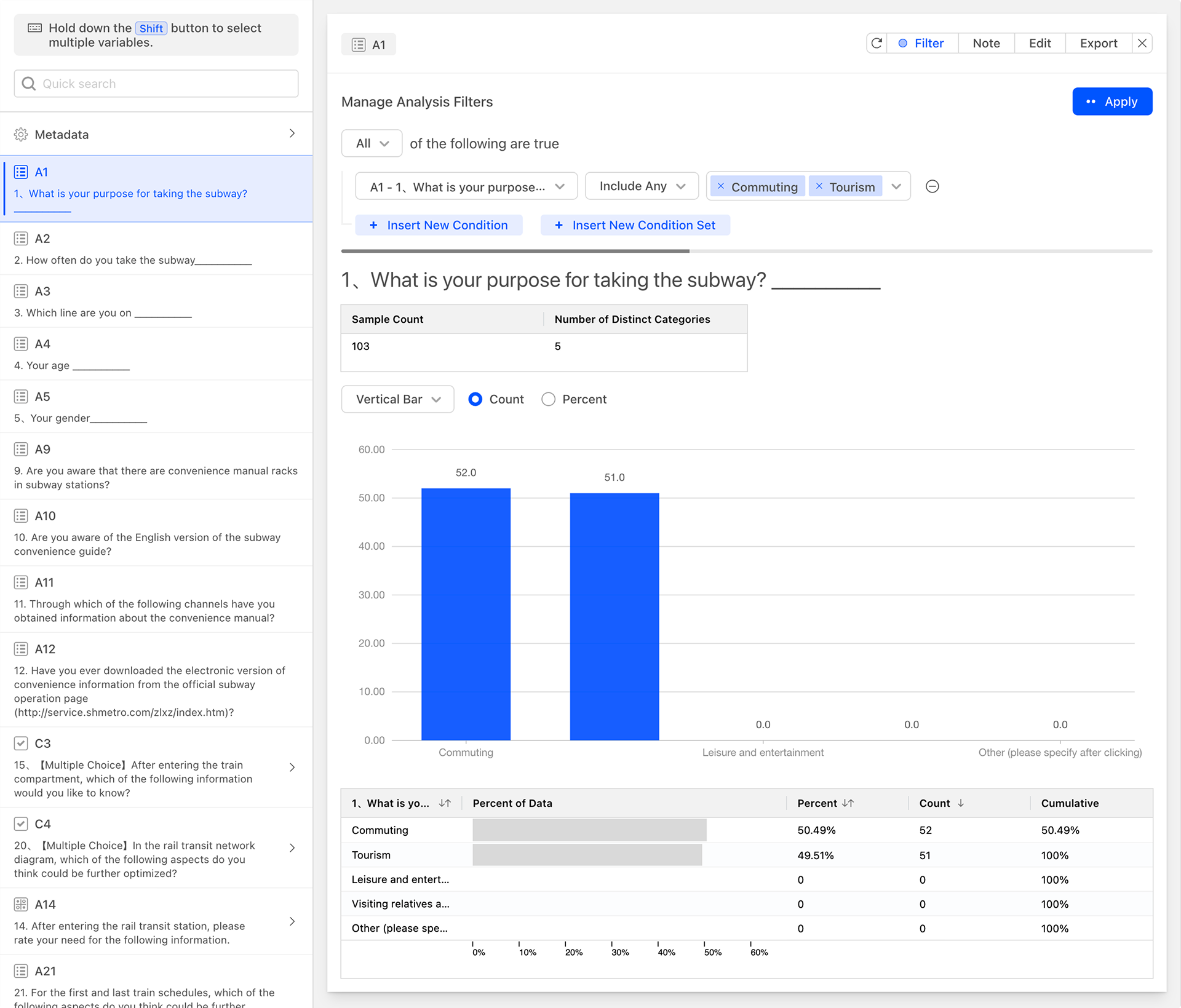
As shown in the figure below, set filter conditions for the current data by specifying that the data should include any options related to commuting or travel in question A1. The system will then update the data analysis chart, and you can see that both the data analysis chart and the sample statistics table have been updated with the latest filtered data. At this point, the sample count in the sample statistics table represents the total number of items after filtering.
Currently, we are filtering data for A1 and displaying the data analysis chart for A1. In fact, when filtering data, you can filter data for other questions and are not limited to filtering data for the current question only. As shown in the figure below, set the data filter condition to include any data related to the age groups 26-35 and 36-45 in question A4, and the system will then update the data analysis chart.
Based on the needs of the analysis, you can also add multiple sets of filter conditions with different combinations of conditions to the data analysis card, allowing you to conveniently and quickly obtain more personalized data analysis charts.
Adding Comments
Click the Comment button and enter your comments in the comment text input box above the data analysis chart. This will facilitate the interpretation and understanding of the data chart.
Editing
Personalize and adjust the current data card.
- Display Options: Turn the data chart on or off.
- Color: Adjust the color of the data chart.
- Labels**: Adjust the text of the data labels.
Exporting
Export the current data card in Excel file format.
Generating Data Analysis Cards
Generate All
When there are no data analysis cards for the questionnaire, you can click the "Generate All" button to generate data description analysis cards for all questionnaire questions at once.